
Inquiry
Form loading...
Choosing the right Chameleon Powder Pigment requires more than admiring a dramatic color shift. A sample may glow green under showroom lights, then appear bronze beside a window. That change is the product’s character, but it can also expose weak testing.
Dr. Andreas M. Weber, an effect-pigment consultant with experience in coatings and decorative finishes, explains, “A beautiful color is not enough; it must remain stable, safe, and repeatable.” This principle guides the ten tips in this article. They examine color travel, particle size, substrate compatibility, binder selection, coverage, light performance, and batch consistency. Each factor affects the final surface.
Check the pigment under warm and cool lighting. Test it on black, white, and colored bases. Observe the finish from several angles. Small differences matter.
A powder that looks spectacular in a jar may lose its shift after mixing. Another may settle quickly or create rough patches on a smooth panel. These are not minor details. They influence appearance, production time, and customer trust.
Reliable selection also involves technical documents, responsible handling guidance, and clear supplier communication. Do not judge performance from photographs alone. They often hide uneven coverage and exaggerated lighting.
Some choices remain imperfect. A stronger color shift may reduce hiding power. A finer particle may improve smoothness but weaken visual drama. There is no universal winner.
The best Chameleon Powder Pigment matches the application, surface, lighting environment, and performance expectations. Careful testing turns an attractive idea into a dependable finish.
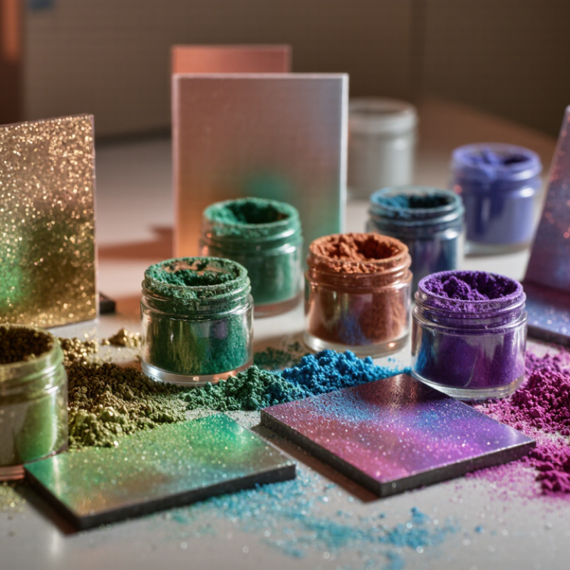
10 Tips for Choosing Chameleon Powder Pigment
Understanding Chameleon Powder Pigment and Its Color-Shifting Effect
Chameleon powder pigment is an interference pigment, not a conventional dye. It contains thin reflective flakes that redirect light at changing angles. A dark base usually creates stronger contrast. A pale base can soften the transition. Under direct sunlight, one sample may flash green, violet, and blue. Indoor lighting may show less movement. The effect depends on viewing angle, illumination, particle size, and coating structure. This concept matters before choosing a powder.
Check ten practical details. Review color travel, dominant shade, particle size, and transparency. Examine recommended loading, dispersion method, binder compatibility, heat resistance, lightfastness, and batch consistency. Ask for technical data and a small sample. Test it on the actual substrate, not only on white card. Use a controlled film thickness. Inspect it under warm, cool, and angled light. Keep notes on mixing time and settling. Poor dispersion can create dull patches or uneven flashes. A clear binder often preserves the optical shift better, but each formula behaves differently.
I once trusted a dramatic sample and ignored its weak coverage. The finished layer looked attractive near a window but flat under office LEDs. That mistake changed my process. Now I compare drawdowns after drying, abrasion, and short heat exposure. I also check the safety data sheet and local compliance requirements before production. Avoid promising one fixed color. Chameleon effects depend on lighting. Screen images can mislead. Record the viewing conditions with every sample.
| No. | Selection Dimension | What to Check | Why It Matters | Practical Selection Guidance | Verification Method |
|---|---|---|---|---|---|
| 1 | Color-Shift Direction | Identify the two or more visible colors across the viewing angle, such as a blue-to-purple or green-to-gold transition. | Chameleon pigment does not produce one fixed color. Its appearance changes because reflected light is modified by thin-film interference and the observer's angle. | Choose a color travel that contrasts clearly with the base coat and suits the intended visual effect. | View a coated sample under daylight while slowly changing the observation angle. |
| 2 | Particle Size | Review the supplier's particle-size distribution and median particle size. Decorative interference pigments commonly use micrometre-scale particles. | Smaller particles generally create a smoother, more uniform appearance, while larger particles can provide stronger sparkle or coarser visual texture. | For smooth coatings and detailed graphics, start with a fine grade. For stronger sparkle, evaluate a medium or larger grade if the surface can accept it. | Compare drawdowns at equal pigment loading and inspect both normal and angled views. |
| 3 | Base-Coat Color | Test the pigment over black, white, neutral gray, and the actual colored substrate. | Interference pigments are translucent or semi-transparent; the underlying color can significantly alter brightness, saturation, and the perceived color shift. | Use a dark base when maximum depth and contrast are required, but confirm that the chosen pigment remains visible over the final substrate. | Prepare a small color-card series with identical topcoat thickness over several base colors. |
| 4 | Optical Effect | Distinguish between color travel, pearlescence, sparkle, glitter, and opacity. | Color travel is an angle-dependent hue change, whereas sparkle is a bright point-like reflection. These effects are related but are not interchangeable. | Select a true interference or multi-layer effect pigment when the main requirement is a visible color change rather than only brightness. | Use angled lighting and a rotating sample to separate color travel from simple metallic reflection. |
| 5 | Binder Compatibility | Check compatibility with the intended water-based, solvent-based, UV-curable, powder-coating, ink, or cosmetic system. | The binder affects wetting, dispersion, film formation, gloss, adhesion, and long-term stability. A pigment that works in one system may not perform identically in another. | Choose a grade supported by documented compatibility data and avoid assuming that a general-purpose grade fits every resin system. | Run a laboratory drawdown or molded-panel test and check appearance, adhesion, and stability after curing. |
| 6 | Pigment Loading | Determine the recommended use level from the technical data sheet and compare several concentrations around that level. | Too little pigment can produce a weak effect; too much can reduce transparency, increase viscosity, create flooding or floating, and lower surface uniformity. | Use a controlled concentration ladder rather than selecting the highest loading. The optimum level depends on particle size, binder, film thickness, and base coat. | Prepare at least three loadings while keeping application method, wet-film thickness, and curing conditions constant. |
| 7 | Dispersion and Shear | Confirm whether the pigment should be gently incorporated or subjected to high-shear dispersion. | Some effect pigments can be damaged, fractured, or optically altered by excessive milling or aggressive shear, which may reduce the intended appearance. | Follow the processing guidance for the selected grade. Prefer controlled, low-damage incorporation when the pigment consists of delicate platelets or layered particles. | Compare samples made with different mixing speeds and times, then inspect color travel and surface uniformity. |
| 8 | Film Thickness and Orientation | Evaluate the effect at the actual coating thickness and application method, including spraying, brushing, printing, or molding. | Platelet orientation and film thickness influence reflection, gloss, hiding power, and the strength of the color-shifting effect. | Choose a pigment that performs consistently at the production thickness. A smooth film with well-oriented particles normally gives a clearer optical effect. | Measure or control wet and dry film thickness and compare panels produced by the intended process. |
| 9 | Durability Requirements | Review resistance requirements for light, heat, moisture, chemicals, abrasion, and weather exposure. | Durability depends on both the pigment construction and the surrounding coating system. Outdoor exposure, cleaning chemicals, and elevated temperature can change appearance or adhesion. | For demanding applications, select a grade with relevant test data rather than relying only on an attractive laboratory sample. | Use application-specific tests such as accelerated light exposure, humidity exposure, chemical spot testing, and adhesion testing. |
| 10 | Safety and Regulatory Fit | Check the safety data sheet, technical data sheet, ingredient or composition information, particle-handling guidance, and application regulations. | Requirements differ between industrial coatings, printing inks, plastics, personal-care products, and other uses. Powder handling may also require suitable ventilation and dust-control measures. | Choose only a grade documented for the intended market and application. Confirm compliance before scale-up or commercial use. | Review current documentation and obtain application-specific regulatory confirmation before production. |